
The Power of Colour!
Colour and Power
Words and Graphics by Katie Weston
As handcrafters and spinners, colour is vitally important. The colour you choose to dye, spin, knit, or weave impacts your final work, your feelings about it, and others’ interpretations of it. This has long been true of colour, which has often been associated with power, as humans have used certain colours to signify position and status. Roman Emperors limited access to Murex Purple so only those in a position of power could wear that shade. In Medieval Europe, the Sumptuary Laws limited what people could wear according to their position in society. Peasants wore a dull earthy colour, whereas only nobles could wear a bright saturated colour such as scarlet.
Most modern colour rules would dictate that Elizabeth I, famously a redhead, really shouldn’t have worn a bright orange-red such as scarlet. However, the power of the colour was far more important to Elizabeth. During her time as a princess, she regularly wore scarlet, amplifying her message that she was the heir to her sister Mary I. Once she became Queen, however, she changed her message; scarlet was still a colour associated with promiscuity, and that was not the message the Virgin Queen wished to send. Instead, she dressed her ladies and retainers in scarlet to act as a symbolic backdrop to the paler colours she adopted in her own clothing.
Language of Colour
In addition to the colours themselves, the language we use to describe colour reveals a lot about the way a culture thinks about the world. Homer famously described the sea as being wine-dark. He uses the expression many times throughout his epics, The Iliad and The Odyssey, to describe the colour of the Aegean sea. This sea is very much the same blue colour as all the other bodies of water across the planet. So why doesn’t Homer describe it as being blue?
Well, for starters, the Ancient Greeks didn’t have a single word to signify blue.
Homer gives the sky the non-blue descriptive treatment as well: big, starry, or of iron or bronze. The sea is also described as whitish (polios), blue-grey (glaukos), almost black (kuaneos), and on occasion it’s even described as being purple (porphureos). So given the dominance of blue in the Greek landscape, why is there no word for blue?
Describing the June sky above the Aegean as the same colour as that Aegean sea in December during a storm does seem a little limiting. Instead, the Greeks used far more descriptive language; when the sea is described as wine-dark, it doesn’t mean the sea was the colour of red wine. Wine-dark is used in Greek literature to describe darkened blood, a cloud, a tree, and the glint of metal. It’s not actually a colour description as we would recognise today. Wine-dark doesn’t mean red; it has more to do with the lustre or superficial effect than anything related to a spectrum of shades. It’s a very different way of thinking about colour than the one we presently use.

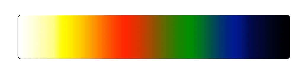
How the Greeks perceived colour as a continuum from light to dark.
The Colour Spectrum
The Greeks created their spectrum on a different basis than ours, where light or dark were far more important than the actual hue[1] of a colour. Colours were arranged on a spectrum from white to black. Yellow was considered to be so light as to merge into white, with red and green being mid-tones and with blue being seen as a shade of black at the darkest end. This way of perceiving and describing colours is by no means unique to the Ancient Greeks, and blue is not the only colour missing from their vocabulary. Yellow is also absent, as it is in some Slavic languages, Ainu from Northern Japan, Daza from Nigeria, and the language used by the Mechopdo, in what is now California. Each uses the same word within their language to describe what Western languages call blue and yellow. The use of the same word for blue and green is even more common. The Celtic languages use the word glas to describe a shade the colour of a mountain lake; it covers every colour from a brown-ish green to blue. In Japanese, awo can mean blue, green, or even dark depending on the context.
This way of looking at colour is not something unique to the Greeks. In nearly all cultures, the linguistic distinction between light and dark happens first. After that, the word for red tends to be used, then yellow, then green, then blue. There are of course many exceptions to this, but broadly speaking, the distinction between light and dark is something most cultures develop long before any need to give specific hues a single name.
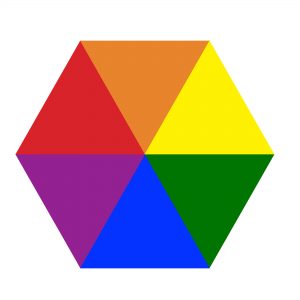

The modern colour wheel in which opposite colours are said to be complementary. However, when viewed in greyscale, some of the colours are revealed as lacking contrast, so they do not tend to stand out from one another.
Colour Value
In Western culture, our modern spectrum is a comparatively recent development. For example, a Medieval painter was unconcerned about portraying a colour accurately; the significance of the colours were far more important, especially when used to portray awe and respect. Pigments were costly, so the use of certain colours displayed the wealth of a patron. Vast expanses of ultramarine, vermillion, and gold were not important for colour accuracy – they were important for prestige and power. But those Medieval artists also understood colour theory and how to further enhance the brilliance of a particular shade. The Italian Leon Battista Alberti wrote De Pictura, a technical painting guide, in 1435 for any would-be artist. He offered this advice on the placement of colours: “If red stands between blue and green, it somehow enhances their beauty as well as its own. White lends gaiety, not only when placed between green and yellow, but almost to any colour. But dark colours acquire a certain dignity when between light colours, similarly light colours may be placed to good effect among dark.”
What’s amazing is how this nearly 600 year-old advice could actually come out of any book you might read today. When thinking about colourwork knitting, the interactions of colours in a warp and weft, or whether to ply 2 different hand-dyed colourways together, the impact of light next to dark is just as important as the hue of the chosen yarns.
Light and dark are crucial for colour combinations, and we are often advised to take a photograph and switch the colours to greyscale. To enhance one another, the colours should be different shades of grey. In a way, this idea reverts back to the Ancient Greek way of thinking about colour. Colours of a similar value[2] will blend together, even if they are quite different hues. Colours that are different in value will stand out from one another.
Colour can often leave people running scared. They’ve been told long-ago, often in childhood, that 2 shades don’t go together or that a certain colour doesn’t suit them and they should never wear it. Our modern Newtonian method of describing colours and how they relate can lead to a very narrow way of looking at the materials we work with. The modern colour wheel theory says opposite shades will contrast with one another but fails to take into account the advice given by Alberti – sometimes it’s about more than opposites; you need to add some light or dark to give real power to your colours. Equally, don’t let colours have too much power over you. Channel your inner Elizabeth I, and go ahead and dye, spin, knit, weave, and wear the colour you love.
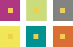
Colours are affected by the shades that surround them. The yellow box in the centre of all these colour swatches is the same shade.
[1] Hue describes the actual colour of any given shade. So in our modern lexicon, red, green, orange, purple, etc.
[2] Value describes how light or dark a colour is.
Katie Weston lives in the hills of Snowdonia, Wales. She spends her day dyeing spinning fibre in every colour of the rainbow, so it’s perhaps a little understandable that she’s obsessed with describing it, and the history of colour. She’s the author of the book A Guide to Spinning Hand Dyed Fibre.


Leave a Reply
Want to join the discussion?Feel free to contribute!